Of all the types of tables, Table is probably the most difficult to read. It has too much data and often has no ordering. This leads to a situation where “numbers are still numbers” but have no meaning, making it difficult to compare and describe. So, when approaching a Table, the first thing before starting to write is to rearrange the information to make sense.
Have a look at the following table:
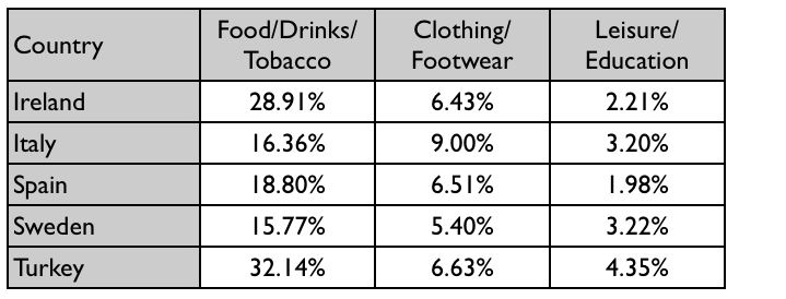
The table below gives information on consumer spending on different items in five different countries in 2002.

You can see there are 15 numbers in this table. Of course, we cannot report each number in turn. Instead, choose a axis to compare. You can go along (by Country) or traverse by each type of item (by Items):
- Follow Country: if you use Country as the axis to describe, you will consider each country to see how they spend on the three items in the table.
- Following Items: If Items are axes, you would describe the difference in expenditure for each item of the country.
When doing Table task, not choosing any axis will give us 2 equivalent posts. In fact, one axis makes us have a more logical article than the other axis. If you notice above, if you write in Country, you will have to write an article of 6 different ideas, while writing in Items, the coal only has 3 different ideas. Similar to the spirit of the chart article, we always try to make fewer and more comparisons. So we can see, if followed Items, our article will have more comparisons (5 objects vs 3 objects). This also means that the reader after reading our article will remember more.
After selecting the axis, we can go into the table description. Like charting articles, you should always comment on this table. Since we have set an axis to describe as Items, we will comment on Items. It can be seen that people spend the most on Food / Drinks / Tobacco and at least on Leisure / Education
Looking at the graph, it is immediately obvious that people in six countries spend the most on food, drinks and tobacco while allocating the smallest portions of their budget to leisure and education.
Note: You can see above is that the word spend on the first side has been paraphrase back to allocate … portion to the back. In Task 1, we try not to repeat the two structures. Of course, you can write “… spend the most … spend the least …”, but the article will be more appreciated if you have more than one way to express an idea.
After making a general comment, you will go into the description along the selected axis. So, if you use Items as an axis, you will describe the difference of the same item in different countries. You should note not to write in this way:
In Food / Drink / Tobacco, Ireland spent A%. Italy spends B%. Spain spends C%. etc.
This style of writing does not reflect the relationship between the countries we want to compare. Instead, group the countries together. Looking at the table, we can clearly see that in Food / Drink / Tobacco, Ireland and Turkey spend significantly more than in the other 3 countries. So you can write:
Among the five countries, it can be noted that the expenditure for food, drinks and tobacco of Turkey and Ireland was significantly higher than that of the others, at 32.14% and 28.91% respectively. In the same category, Italy, Spain and Sweden all spent under 20% of their budget with Sweden having the smallest percentage at 15.77%.
As you can see, none of the expressions are used twice. You can repeat, but if possible, avoid doing this in the same paragraph. Task 1 only has 12-15 sentences, so it is not difficult to paraphrase.
Similarly, you can write a paragraph describing the remaining 2 items as follows:
Compared to food, drinks and tobacco, spending for clothing and footwear is noticeably lower in all countries. With the exception of Italy who spent 9% on these items, the expenditure of the other countries in this category was relatively the same and below 7%. The smallest proportion of spending was allocated to leisure and education. In this category, Turkey has the highest percentage of national consumer expenditure at 4.35% while the smallest figure can be seen in Spain at only 1.98%.

